Monday, March 30, 2009

Healthy Alternatives: Quick Launch Edition (beginner)

Quick launch buttons are those tiny buttons on the left of your taskbar that you use for quickly launching (makes sense, right?) programs you commonly use. Probably, you never really found them that annoying, but there’s also a part of you that kind of wishes for Mac OSX’s shiny dock instead. Don’t worry, I can help.

How MS dropped the ball:
They were on the right track with this since day 1, but never really developed quick launch further, to make it into a noteworthy productivity tool.

clip_image001

You might say, "well...its launching programs. How could you possibly make that a noteworthy event?" Enter Mac OSX featuring the application dock. Exact same thing, a whole lot prettier. The main difference is usability. Clicking on dock icons is a lot more satisfying than quick launch icons because they’re so much bigger. It's a subtle difference that managed to differentiate apple OSX enough to call it a "new" feature, that, in all honesty, is a lot better.

clip_image001[4]

How to compensate for their failure:
ObjectDock is a lot like the Mac dock, but for windows.

clip_image001[6]

It is totally skinnable, so you can make it look pretty much however you want.

If you’re interested in having larger Quick Launch icons without installing a fancy dock, you can always just right click the Quick Launch bar, and go to View>Use Large Icons.

Healthy Alternatives: Gadget Edition (beginner)

With the release of Microsoft Vista, gadgets were introduced for the first time as part of a kernel windows OS.

How MS dropped the ball: not actually making any useful gadgets. Take for example the calendar gadget. Logically, you would think that this would sync with Windows Calendar, displaying upcoming events and tasks.

clip_image001[6]

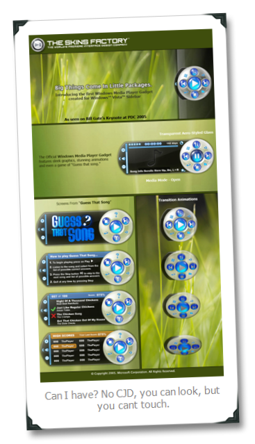
Nope. Just gonna tell you the date really big. Another prime example is the Windows Media Player Sidebar gadget. They advertised one that looks great, and very useful. Turns out its just a Photoshop mockup....not an actual gadget you can use. its like MS thinks its some kind of kinky tease, to promise useful things then be like "not! HA!". Makes me feel like their bitch.

How to compensate for their failure:
Yahoo Widgets is a great alternative with a lot more widgets to choose from.

I’m especially a fan of the “daily planner” widget, that can show you a whole month or more at a time of upcoming events that you can colorize by category. You can also sync it with Google Calendar, if you need your calendar online.

Sunday, March 29, 2009

Comment System

I’ve been told there is some confusion about how to leave a comment. If you don’t see a comment box below the post you want to comment on, click on the title of the post, and then check again. You should be good to go.

Also, you don’t need to make an account to leave a comment.

Using iGoogle to follow this blog, and other (less awesome) news feeds (beginner)

For those of you who still think that a homepage is just the first page in front of you when you open your web browser, I’ve got some great news for you. Your homepage can become a broad, informative, interesting, time absorbing creature in no time at all.

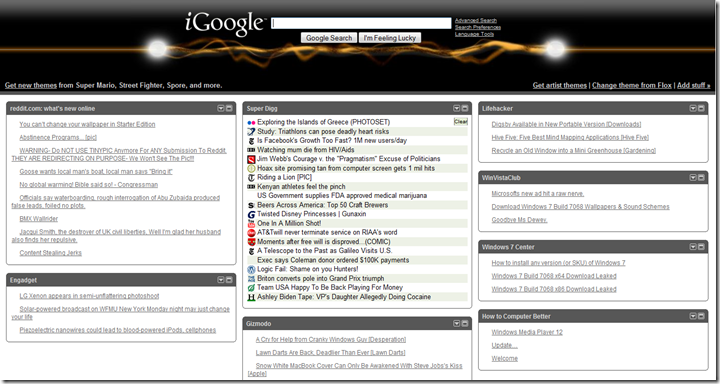
Enter iGoogle: RSS Reader extraordinaire. Because this is a blog for people who don’t computer good, I’m going to assume you don’t know what RSS is. Basically, most sites that have regularly updated info on them will provide “RSS feeds” that can be added to pages like iGoogle. It puts a little box on your page with the latest headlines on it that you can then follow to the story. So basically, if you can imagine a page covered in RSS feeds, with the top headlines from all your favourite websites on one page, you have iGoogle.

clip_image001

You have to have an iGoogle account, and then you just sign in at igoogle.com. From there it’s pretty straight forward to add Tabs for different categories of websites you like, change themes, add stuff, and a whole lot more.

Once that’s set up, you can add stuff on the fly. Say, for example, you want to add this blog to your RSS feeds on your iGoogle page. If you’re using Firefox, take a look on the right side of the address bar for this:

clip_image001[6]

You probably don’t have the folder icon, (which is part of a sweet program i’ll be talking about another time), but you will see the orange RSS button. Click that, and you’re pretty much good to go.

If, for some filthy reason, you’re still using Internet Explorer, you can still do this. You want to look for the same button to the right of your tabs, below the address bar:

clip_image001[8]

At this point, the process for either browser is about the same.

iGoogle is the first step to getting more of the news you want, when really all you wanted to do was check your email. Use this power wisely.

If you’re already familiar with iGoogle and have something to add, or if you have any questions, leave a comment!

Windows Media Player 12

You know what I hate? The first 6 seconds of every song on my computer. I start listening, and I’m like, “ugh…just get to the point, song! I don’t care for your logical musical progression.”

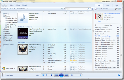
Fortunately, Microsoft has heard my cries, and released Windows Media Player 12: the first music player to permanently remove the first few seconds of every song in your media library that gets played. Sweet!

My guess is that this new beta has some trouble with “meta data,” the part of the audio file that contains all that fun stuff like artist info, album, rating, etc. An alternative hypothesis is that WMP12 cant afford to play a full audio file anymore because of the regression. Or 9/11.

clip_image001